Behind the Workflows

ENTERPRISE UX · HEALTHCARE · WORKFLOW DESIGN

A healthcare operations platform, six enterprise modules, and workforce managers who deserved better tools. I redesigned the systems that made their day manageable

Role: UX Designer + Researcher · Duration: 3-4 weeks

35%

Faster Task Assignment

Workforce managers spent significantly less time locating, filtering, and assigning tasks.

25%

Reduction in Cognitive Load

Self-reported post-redesign , fewer decisions
required to complete the same tasks.

3-5 min

Saved per CSV Report

Downloads no longer blocked the interface,

users kept working while exports ran.

4+

Modules Adopted

ECR, AMC, Auth, and internal modules, consistent UI where there wasn't one

The Platform

The Platform

The Platform

The tools behind the tools

that run healthcare.

The tools behind the tools that run healthcare.

athenahealth builds software for healthcare organisations, billing systems,
clinical records, patient engagement. Behind the patient-facing side of
healthcare sits an operational layer most people never see.

athenahealth builds software for healthcare organisations, billing systems, clinical records, patient engagement. Behind the patient-facing side of
healthcare sits an operational layer most people never see.

Workforce managers assigning insurance claims, prior authorisations, and
case reviews. Every single day. On six enterprise modules with different UI
patterns, different interaction conventions, and zero consistency between
them.

Workforce managers assigning insurance claims, prior authorisations, and case reviews. Every single day. On six enterprise modules with different UI patterns, different interaction conventions, and zero consistency between
them.

The work I was brought in to do wasn't to redesign a single screen. It was to
untangle the systems underneath.

The work I was brought in to do wasn't to redesign a single screen. It was to untangle the systems underneath.

The Problem

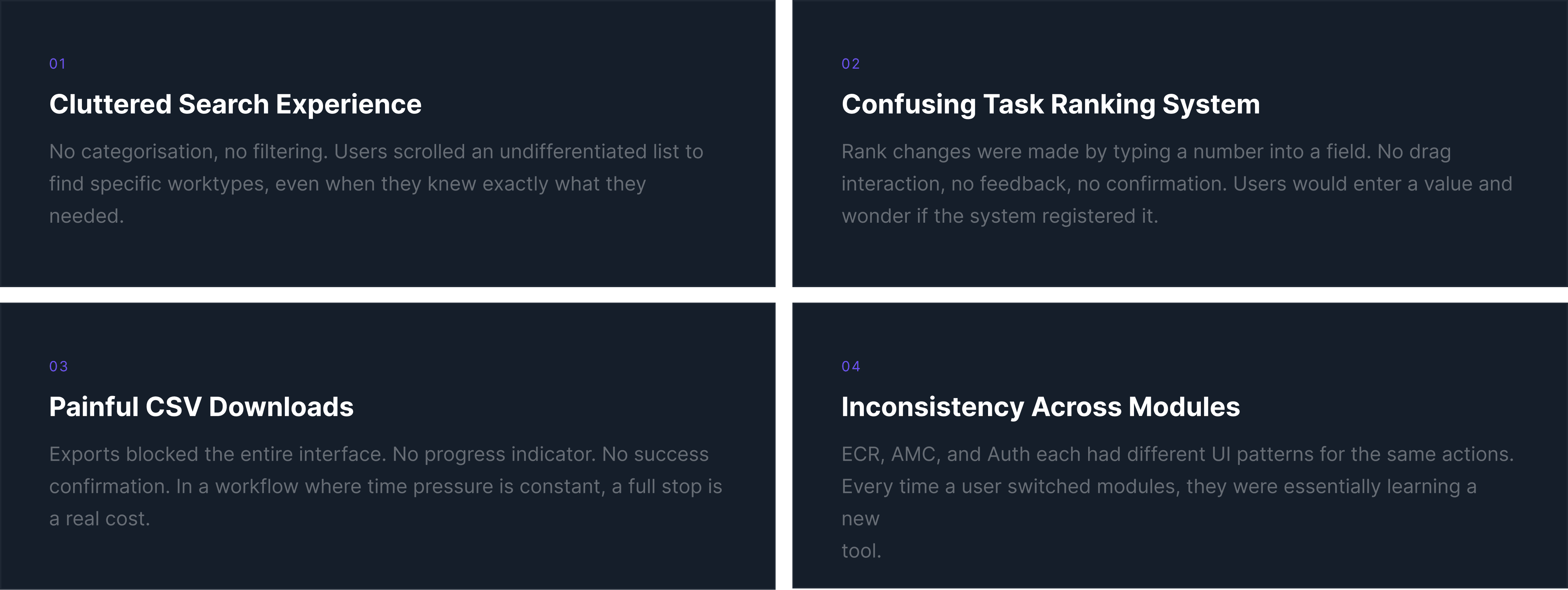
Four problems. One platform. Used by the same person, every day.

The issues weren't isolated to one screen. They ran through the entire operations layer, search, task management, exports, and consistency.
Fixing one without the others would have left Felin with a better search bar, inside a still-broken system.

The issues weren't isolated to one screen. They ran through the entire operations layer, search, task management, exports, and consistency.
Fixing one without the others would have left Felin with a better search bar, inside a still-broken system.

What the research revealed

Primary User

I watched a workforce manager spend six minutes trying to assign a single task. Six minutes. One task. That's where this started.

The Problem

Four problems. One platform. Used by the same person, every day.

The issues weren't isolated to one screen. They ran through the entire operations layer, search, task management, exports, and consistency.
Fixing one without the others would have left Felin with a better search bar, inside a still-broken system.

The issues weren't isolated to one screen. They ran through the entire operations layer, search, task management, exports, and consistency.
Fixing one without the others would have left Felin with a better search bar, inside a still-broken system.

What the research revealed

User Journey

User Journey

User Journey

A smooth start, then everything slows down

A smooth start, then everything slows down

I mapped Felin's end-to-end workflow across six stages. The emotional curve told the story more clearly than any list of pain points.

Visual Identity

Before redesigning interactions, I established the language.

Different modules used different type, spacing, and colour logic. The first step was agreeing on what the system should look and feel like before anything else was built.

Feature 01 |

Search & Worklist Navigation

Search & Worklist Navigation

The Challenge

The Challenge

The Challenge

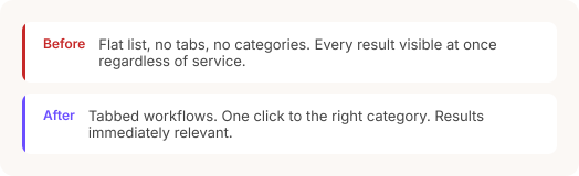
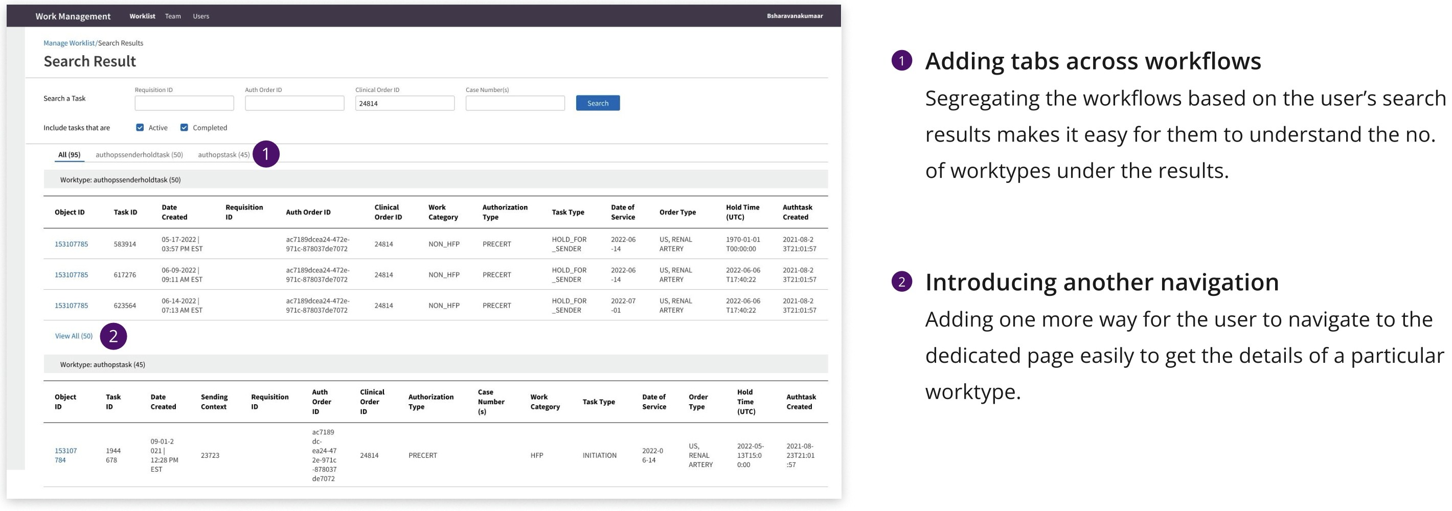
When everything shows up at once, nothing is findable.

Search results had no categorisation, no filtering. Users scrolled
through a flat list that mixed everything together, regardless of
service, status, or relevance..

Search results had no categorisation, no filtering. Users scrolled through a flat list that mixed everything together, regardless of xservice, status, or relevance..

The problem wasn't the algorithm. It was how results were presented once they arrived.

Proposed Solution

Feature 02 |

Task Ranking

Task Ranking

The Challenge

The Challenge

The Challenge

If you can't tell whether it worked, you'll just do it again.

Rank changes were made by typing a number into a field. No drag interaction, no visual feedback, no confirmation that the change registered. Users would enter a value and wonder, so they'd enter it again.

The featured problem

Proposed Solution

Feature 03 |

CSV Export

CSV Export

The Challenge

The Challenge

The Challenge

A download that stopped everyone's work to run its own.

CSV exports blocked the entire interface. No progress indicator, no success confirmation, no error message if something went wrong. In a workflow where time pressure is constant, a full stop is a real cost.

Proposed Solution

What Changed

Small Shifts, Real Impact

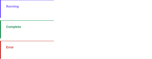
A status chip. A drag handle. A background download. None of these sound like transformative design decisions. But in a system used by real people every day, they were the difference between a workflow that felt under control, and one that didn't.

Primary User

I watched a workforce manager spend six minutes trying to assign a single task. Six minutes. One task. That's where this started.

Create a free website with Framer, the website builder loved by startups, designers and agencies.