Building a Design System from the Ground Up

DESIGN SYSTEMS  ·  COMPONENT ARCHITECTURE  ·  DOCUMENTATION

A growing enterprise platform had evolved with inconsistent UI patterns, no shared design tokens, limited documentation, and no central component library. I built a scalable design system from the ground up, independently, while supporting a live product in production.

Role: UX Designer · Duration: 4-6 weeks

The Starting Point

The Starting Point

No tokens. Different everything.

No tokens. Different everything.

No tokens. Different everything.

The platform had no design system. The features were built at different times by different people, each with different typography, different spacing, different component patterns, different colour usage.

Buttons looked different between modules. Status chips had three different visual treatments. Navigation was inconsistent depending on which module you opened.

This wasn't a design problem. It was an infrastructure problem. The solution
had to be systematic, documented, and developer-owned, or it wouldn't
stick.

This wasn't a design problem. It was an infrastructure problem. The solution had to be systematic, documented, and developer-owned, or it wouldn't stick.

The Problem

No foundation. Every design decision started from zero.

No foundation. Every design decision started from zero.

No foundation. Every design decision started from zero.

No foundation. Every design decision started from zero.

There was no visual language to inherit, no component library to extend, no documentation to reference. Every feature was built in isolation and it showed.

There was no visual language to inherit, no component library to extend, no documentation to reference. Every feature was built in isolation and it showed.

The Process

Audit → Tokens → Components →Documentation → Adoption.

Audit → Tokens → Components →Documentation → Adoption.

Audit → Tokens → Components →Documentation → Adoption.

Five phases, built in order. Each one made the next possible.

Component 01 |

Status Chips & Badges

Status Chips & Badges

Status Chips & Badges

The Problem

The Problem

Three different status treatments. One platform.

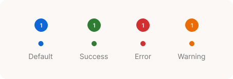
Status chips were the most visible inconsistency in the platform. Three different visual treatments for the same concept - colour, size, and shape all varied by module.

Status chips were the most visible inconsistency in the platform. Three different visual treatments for the same concept - colour, size, and shape all varied by module.

The solution: A single chip component with semantic colour tokens
mapped to system states. Ten states. One visual language.

The solution: A single chip component with semantic colour tokens mapped to system states. Ten states. One visual language.

Component 02 |

Dialogs & Snackbars

Dialogs & Snackbars

Documentation Example

Documentation Example

Written for developers & designers.

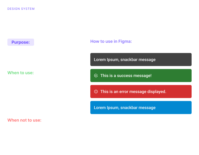
Every component had a doc, purpose, when to use, when not, Figma how-to. If a developer couldn't understand it, it wasn't done.

Every component had a doc, purpose, when to use, when not, Figma how-to. If a developer couldn't understand it, it wasn't done.

This is what a real component doc looked like in the system.

This is what a real component doc looked like in the system.

Component 03 |

Form elements & Buttons

Form elements & Buttons

The Challenge

The Challenge

The Challenge

Forms were the most common UI in the platform and the most inconsistent.

Input fields, dropdowns, date pickers, and validation states all existed in different forms across modules. A user filling out a form in had a different experience to the same action in another module.

Input fields, dropdowns, date pickers, and validation states all existed in different forms across modules. A user filling out a form in had a different experience to the same action in another module.

The solution: A single form element family with shared states, default, focused, error, disabled. Validation messages written to a standard. Error colour tied to the critical token.

Buttons followed the same logic.

Challenges

What building alone actually looks like.

What Changed

A foundation the whole team can build on.

When the system shipped, the platform had a visual language for the first time. It stopped making foundational decisions from scratch. Developers stopped asking what a button should look like.

When the system shipped, the platform had a visual language for the first time. It stopped making foundational decisions from scratch. Developers stopped asking what a button should look like.

When the system shipped, the platform had a visual language for the first time. It stopped making foundational decisions from scratch. Developers stopped asking what a button should look like.

Create a free website with Framer, the website builder loved by startups, designers and agencies.