Culture & Ethnography
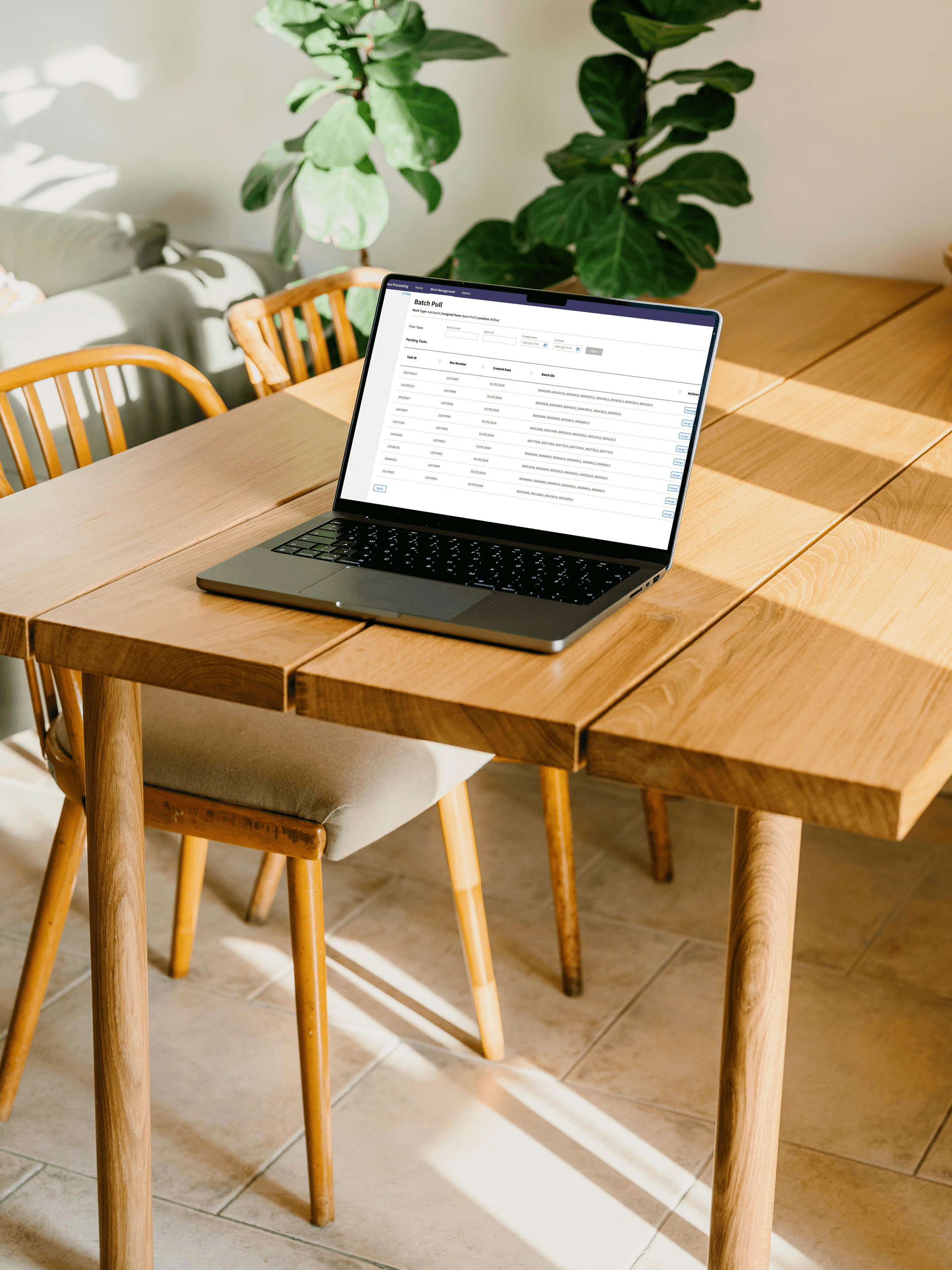
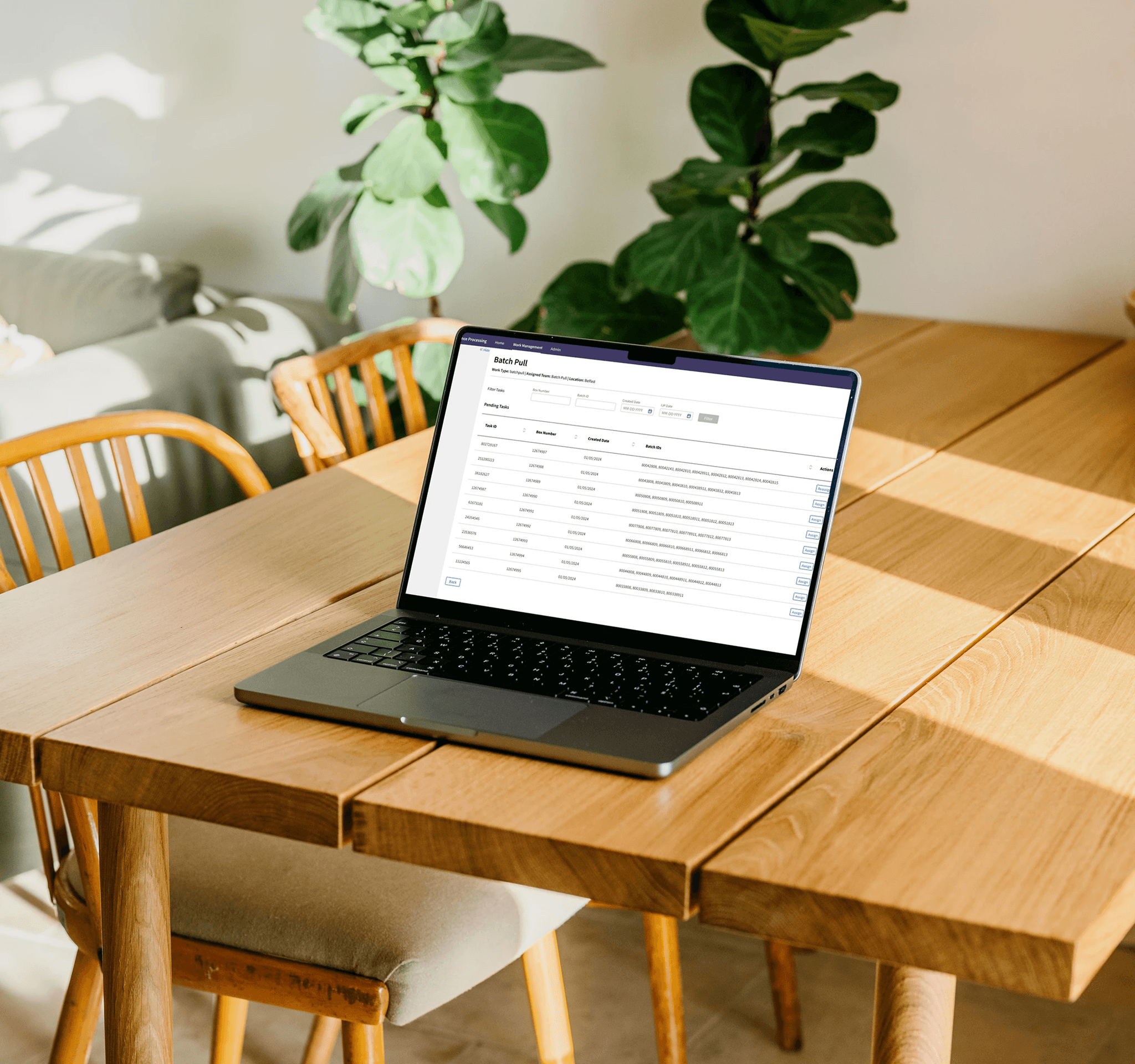
Batch Pull – Task Dashboard
Academic Project
Role: UX Designer + Researcher
Duration: 1 month
Problem Statement
Inspired by the enigmatic allure of ravens and the sharp precision of technology, this project explores the balance between dark, sleek visuals and user-centric design.®
Inspired by the colors and textures of distant galaxies, this project combines bold, fluid visuals with a futuristic user interface. The goal was to create an immersive experience that feels both expansive and intimate, blending 3D animations, interactive elements, and a rich color palette. From its glowing particle effects to its seamless navigation, Nebula is a celebration of creativity and innovation, designed to inspire and captivate.

Approach & Research Style
Balancing bold, eye-catching visuals with practical functionality required innovative thinking and a deep understanding of both form and function. Our goal was to craft an experience that not only captivates.
In today's competitive digital landscape, standing out with a compelling and high-performing portfolio is more challenging than ever. Many creatives, freelancers, and agencies struggle with outdated designs, slow load times, and poor user experiences that fail to captivate potential clients. A lack of visual hierarchy, inconsistent branding, and limited customization options often result in missed opportunities and lost conversions. That's where Raven Claw comes in. We understand the frustration of using generic templates that don’t reflect your unique style or skills. Our solution is built to provide a sleek, modern, and highly customizable portfolio experience that not only showcases your work in the best light but also enhances engagement and credibility. With seamless interactions, lightning-fast performance, and a bold design aesthetic, Raven Claw is designed to help you make a lasting impression and turn visitors into clients effortlessly.


Concept
Raven Claw is built for creatives who want a bold, high-performance portfolio that stands out. With sleek design and seamless interactions.
Your portfolio is more than just a collection of projects—it’s your digital identity, your first impression, and your most powerful tool for attracting clients. Raven Claw is designed to help you make that impression unforgettable. With a bold, cutting-edge aesthetic, seamless animations, and a high-performance framework, this portfolio template ensures your work stands out in the most impactful way. We understand that creatives need flexibility, which is why Raven Claw is fully customizable, allowing you to shape it to match your unique brand and style. Beyond aesthetics, performance is at the core of Raven Claw. With lightning-fast load times, smooth navigation, and an intuitive user experience, your visitors stay engaged, leading to better conversions and higher client engagement.
01
Exploration was non-linear
Users moved freely between spaces, often circling back rather than progressing step by step
02
Emotional Engagement
Visitors were drawn to tactile experiences, rope, pottery, weaving, which slowed down their pace.
03
Cultural Knowledge
Most users lacked historical context and needed visual storytelling to feel connected and informed.
Designing the Structure
Instead of building flat menu items, I created a structure that reflects zones of experience.
Each cultural space became a primary section in the navigation, just as it is in real life. This allowed users to visually and intuitively enter the heritage story from whichever point captured their interest.


Starting with sticky notes that captured user needs, cultural cues, and experience goals, then evolving into a zone-based information architecture that mirrors how people naturally move through the Heritage Village
Ideations
Sketching out how culture could feel on a screen.
This phase was where I began translating everything I’d learned, the cultural rhythm, the emotional pacing, the way people moved through the Heritage Village into early design concepts. Instead of starting with polished visuals, I kept it intentionally rough and open-ended using low-fidelity mockups.
Each wireframe was a way to test an idea quickly:
What if users could scroll through the site like they’d walk through the Village?
How could zones feel distinct, but still part of one shared story?
Could I let visuals and layout carry cultural meaning, without overwhelming the interface?
These sketches helped me define the structure, layout rhythm, and key content blocks. They weren’t about visual perfection , they were about translating place and pace into a web experience.

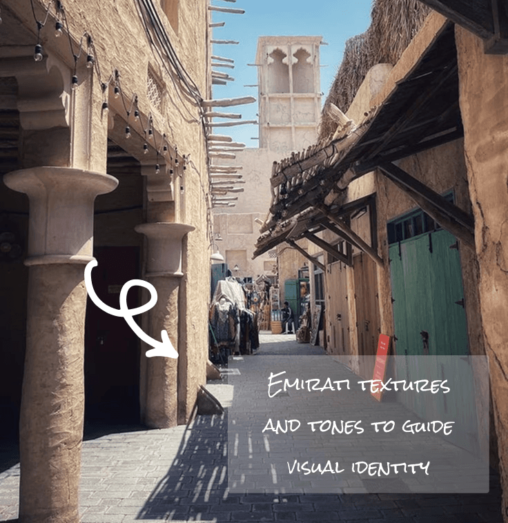
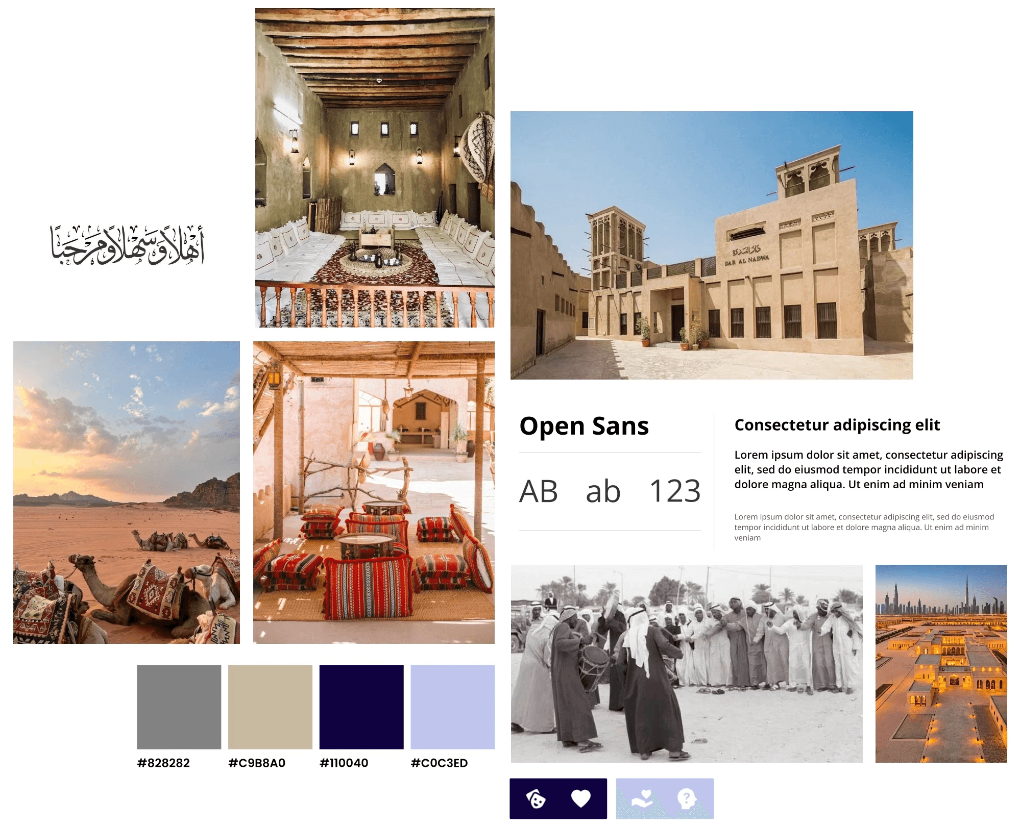
Visual Identity
Bringing heritage to life through soft, grounded design choices
The visual language of Stories in Sand was inspired by the textures, tones, and emotional quiet of the Dubai Heritage Village. Every visual decision from color to typography, was made to reflect a sense of place that feels calm, grounded, and respectful of culture.
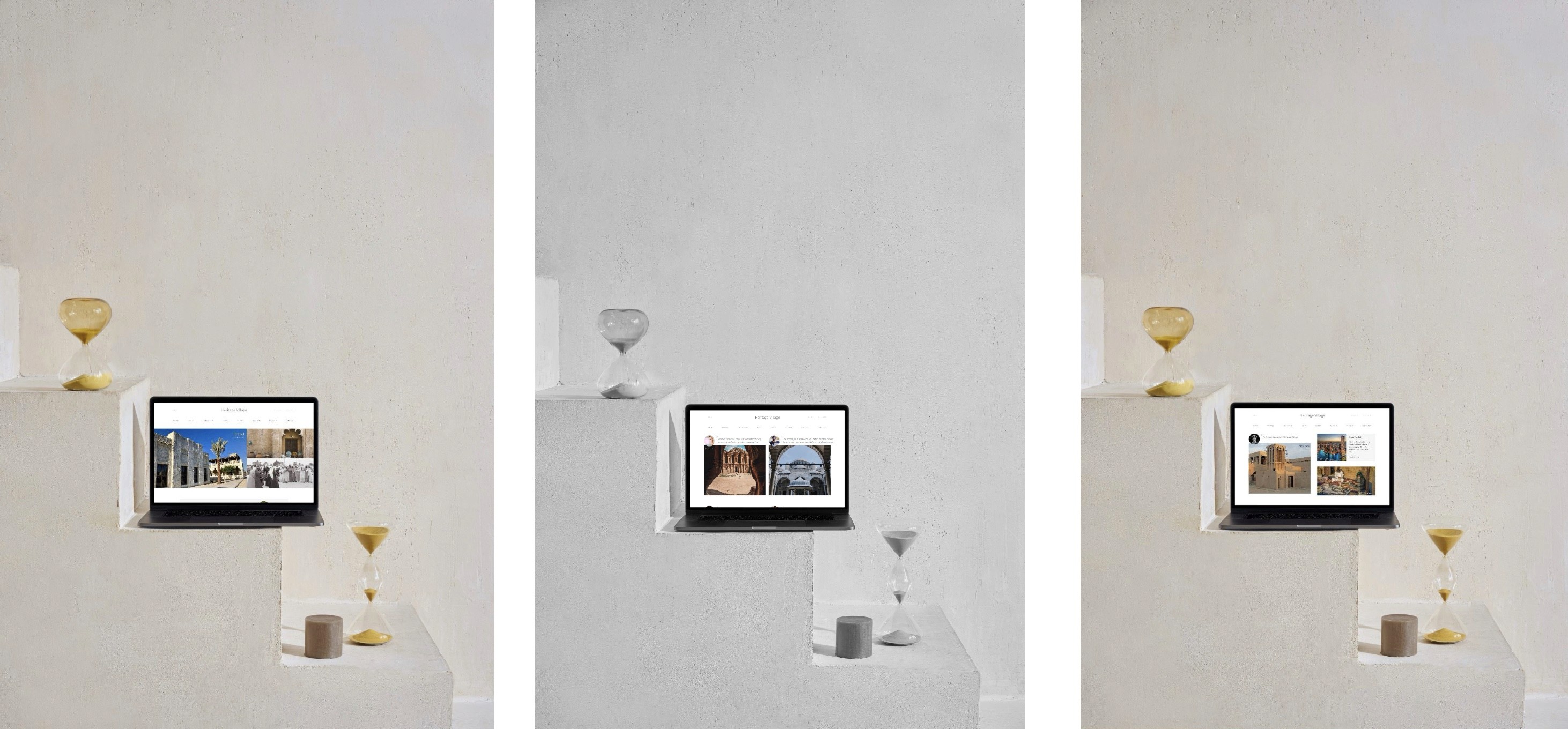
Final Mockups
From research to rhythm, a digital space that feels like the real one.
These high-fidelity screens combine cultural insight with calm design. Each page invites exploration through soft tones, intuitive structure, and immersive imagery reflecting the quiet, open rhythm of the Heritage Village itself.

High-fidelity mockups showcasing key design decisions, from visual storytelling and cultural tone to content flow and user-centered structure.
Reflections
Reflections
From Research to Resonance
Through 12+ hours of cultural research and 3 rounds of design iteration, I learned how to translate real-world emotion into digital rhythm. Crafting 6 high-fidelity screens taught me to balance storytelling with structure and design not just for users, but for meaning.
More Works
©2025
More Works
©2025
Culture & Ethnography
Batch Pull – Task Dashboard
Academic Project
Role: UX Designer + Researcher
Duration: 1 month
Problem Statement
Inspired by the enigmatic allure of ravens and the sharp precision of technology, this project explores the balance between dark, sleek visuals and user-centric design.®
Inspired by the colors and textures of distant galaxies, this project combines bold, fluid visuals with a futuristic user interface. The goal was to create an immersive experience that feels both expansive and intimate, blending 3D animations, interactive elements, and a rich color palette. From its glowing particle effects to its seamless navigation, Nebula is a celebration of creativity and innovation, designed to inspire and captivate.
Approach & Research Style
Balancing bold, eye-catching visuals with practical functionality required innovative thinking and a deep understanding of both form and function. Our goal was to craft an experience that not only captivates.
In today's competitive digital landscape, standing out with a compelling and high-performing portfolio is more challenging than ever. Many creatives, freelancers, and agencies struggle with outdated designs, slow load times, and poor user experiences that fail to captivate potential clients. A lack of visual hierarchy, inconsistent branding, and limited customization options often result in missed opportunities and lost conversions. That's where Raven Claw comes in. We understand the frustration of using generic templates that don’t reflect your unique style or skills. Our solution is built to provide a sleek, modern, and highly customizable portfolio experience that not only showcases your work in the best light but also enhances engagement and credibility. With seamless interactions, lightning-fast performance, and a bold design aesthetic, Raven Claw is designed to help you make a lasting impression and turn visitors into clients effortlessly.
Concept
Raven Claw is built for creatives who want a bold, high-performance portfolio that stands out. With sleek design and seamless interactions.
Your portfolio is more than just a collection of projects—it’s your digital identity, your first impression, and your most powerful tool for attracting clients. Raven Claw is designed to help you make that impression unforgettable. With a bold, cutting-edge aesthetic, seamless animations, and a high-performance framework, this portfolio template ensures your work stands out in the most impactful way. We understand that creatives need flexibility, which is why Raven Claw is fully customizable, allowing you to shape it to match your unique brand and style. Beyond aesthetics, performance is at the core of Raven Claw. With lightning-fast load times, smooth navigation, and an intuitive user experience, your visitors stay engaged, leading to better conversions and higher client engagement.
01
Exploration was non-linear
Users moved freely between spaces, often circling back rather than progressing step by step
02
Emotional Engagement
Visitors were drawn to tactile experiences, rope, pottery, weaving, which slowed down their pace.
03
Cultural Knowledge
Most users lacked historical context and needed visual storytelling to feel connected and informed.
Designing the Structure
Instead of building flat menu items, I created a structure that reflects zones of experience.
Each cultural space became a primary section in the navigation, just as it is in real life. This allowed users to visually and intuitively enter the heritage story from whichever point captured their interest.
Starting with sticky notes that captured user needs, cultural cues, and experience goals, then evolving into a zone-based information architecture that mirrors how people naturally move through the Heritage Village
Ideations
Sketching out how culture could feel on a screen.
This phase was where I began translating everything I’d learned, the cultural rhythm, the emotional pacing, the way people moved through the Heritage Village into early design concepts. Instead of starting with polished visuals, I kept it intentionally rough and open-ended using low-fidelity mockups.
Each wireframe was a way to test an idea quickly:
What if users could scroll through the site like they’d walk through the Village?
How could zones feel distinct, but still part of one shared story?
Could I let visuals and layout carry cultural meaning, without overwhelming the interface?
These sketches helped me define the structure, layout rhythm, and key content blocks. They weren’t about visual perfection , they were about translating place and pace into a web experience.
Visual Identity
Bringing heritage to life through soft, grounded design choices
The visual language of Stories in Sand was inspired by the textures, tones, and emotional quiet of the Dubai Heritage Village. Every visual decision from color to typography, was made to reflect a sense of place that feels calm, grounded, and respectful of culture.
Final Mockups
From research to rhythm, a digital space that feels like the real one.
These high-fidelity screens combine cultural insight with calm design. Each page invites exploration through soft tones, intuitive structure, and immersive imagery reflecting the quiet, open rhythm of the Heritage Village itself.
High-fidelity mockups showcasing key design decisions, from visual storytelling and cultural tone to content flow and user-centered structure.
Reflections
From Research to Resonance
Through 12+ hours of cultural research and 3 rounds of design iteration, I learned how to translate real-world emotion into digital rhythm. Crafting 6 high-fidelity screens taught me to balance storytelling with structure and design not just for users, but for meaning.
More Works
©2025