ETHNOGRAPHIC RESEARCH · CULTURAL UX · CONSUMER

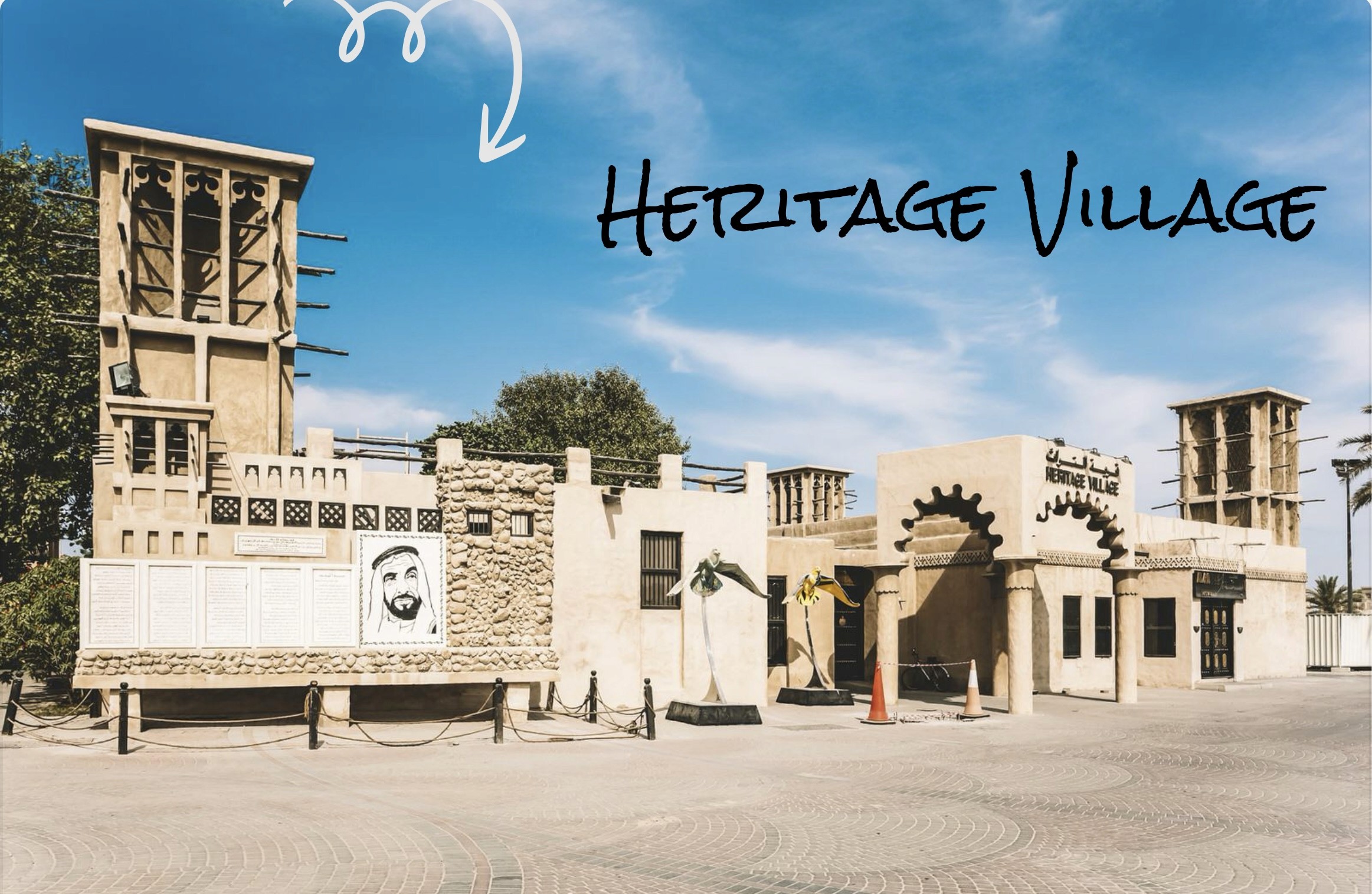
A digital heritage experience for one of Dubai's most visited cultural sites, designed by wandering around it three times before opening Figma.

Role: UX Designer + Researcher · Duration: 1 Month · Academic Project · Dubai, UAE

A place that hits differently in person. Online, it barely existed.

Dubai Heritage Village is one of those places that slows you down without you realising it. Open-air exhibits. Maritime history. Desert farming. Traditional crafts being practiced live.

Online? It barely existed.

No proper website, no structure, no story. Tourists couldn't figure out what it was or why they should care before showing up.

The brief was simple: fix that. The challenge was harder, design something that didn't just give directions and opening times, but something that actually felt like the place.

A UX case study where I tried to translate tradition into interface.

Spoiler: there was a lot of sand, and a lot of scrolling.

Dubai Heritage Village is one of those places that slows you down without you realising it. Open-air exhibits. Maritime history. Desert farming. Traditional crafts being practiced live.

Online? It barely existed.

No proper website, no structure, no story. Tourists couldn't figure out what it was or why they should care before showing up.

The brief was simple: fix that. The challenge was harder, design something that didn't just give directions and opening times, but something that actually felt like the place.

A UX case study where I tried to translate tradition into interface.

Spoiler: there was a lot of sand, and a lot of scrolling.

Dubai Heritage Village is one of those places that slows you down without you realising it. Open-air exhibits. Maritime history. Desert farming. Traditional crafts being practiced live.

Online? It barely existed.

No proper website, no structure, no story. Tourists couldn't figure out what it was or why they should care before showing up.

The brief was simple: fix that. The challenge was harder, design something that didn't just give directions and opening times, but something that actually felt like the place.

A UX case study where I tried to translate tradition into interface.

Spoiler: there was a lot of sand, and a lot of scrolling.

I didn't send out surveys. I didn't run usability tests. I watched.

Travel vlogs, visitor reviews, photo essays, cultural preservation documentation. I mapped the materials and rhythms of the village, rope, palm fronds, textiles, slow-moving crafts. I paid attention to emotional cues. How people talked about their visits. What stuck. What made them smile.

This was contextual inquiry and ethnographic research at its most digital. No interviews, but lots of careful listening.

→Explored travel vlogs, visitor reviews, and photo essays.

→Read up on Dubai's cultural preservation efforts.

→Mapped materials and rhythms across the village: rope, palm fronds, textiles, slow-moving crafts.

→Paid attention to emotional cues - what people remembered, what made them pause, what made them smile.

People didn't move through the Heritage Village like users clicking links on a website. They wandered, paused, revisited.

People didn't move through the Heritage Village like users clicking links on a website. They wandered, paused, revisited.

People didn't move through the Heritage Village like users clicking links on a website. They wandered, paused, revisited.

This concept is more than just a space. It's about reading behaviour.

After conducting contextual inquiry and analyzing vlogs, visitor reviews, and walkthrough footage, I began noticing patterns, not in what people said, but in what they did.

It became clear that I wasn't designing for a task-based interaction. I was designing for a spatial, emotional journey.
Exploration was non-linear
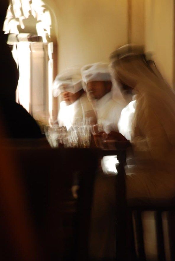
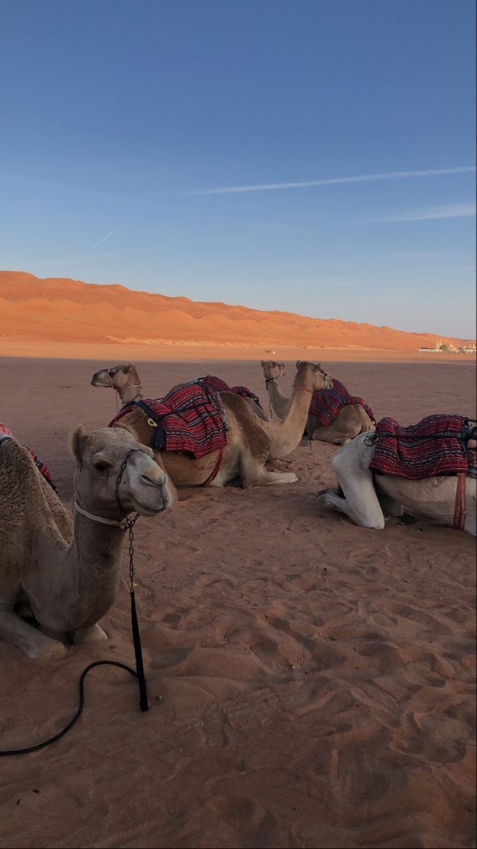
Users moved freely between spaces, often circling back rather than progressing step by step.
Emotional Engagement
Visitors were drawn to tactile experiences, rope, pottery, weaving, which slowed their pace.
Cultural Knowledge
Most users lacked historical context and needed visual storytelling to feel connected
Exploration was non-linear
Users moved freely between spaces, often circling back rather than progressing step by step.
Emotional Engagement
Visitors were drawn to tactile experiences, rope, pottery, weaving, which slowed their pace.
Cultural Knowledge
Most users lacked historical context and needed visual storytelling to feel connected

From sticky notes to zones of experience.

Every wireframe started with one question: what if you could scroll through this site the way you'd walk through the village?

Low-fidelity first, intentionally rough, intentionally open. Testing ideas quickly before committing to any direction.

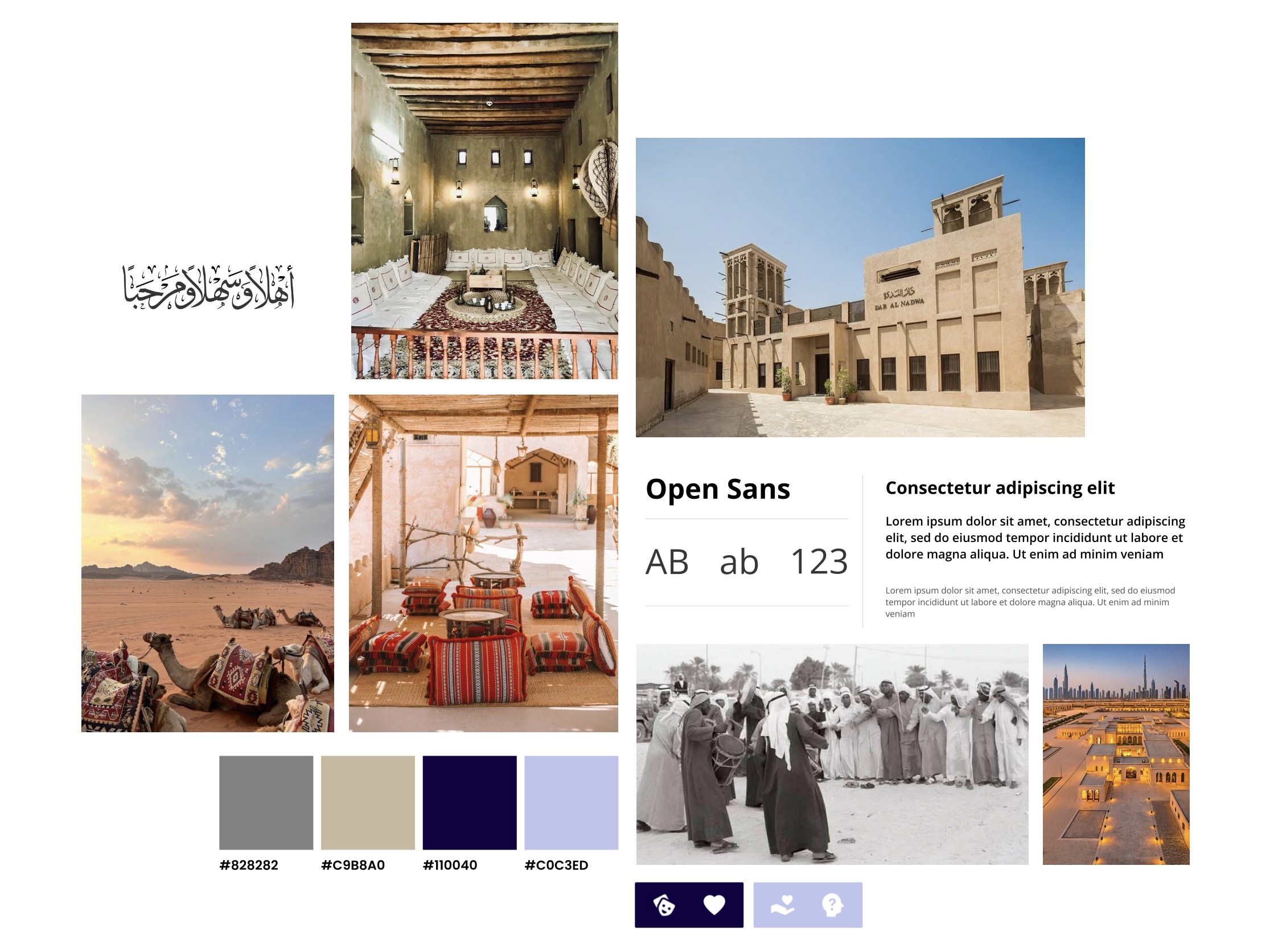
Bringing heritage to life through soft, grounded design choices.

The visual language was inspired by the textures, tones, and emotional quiet of the Dubai Heritage Village. Every decision, from color to typography, was made to reflect a sense of place that feels calm, grounded, and respectful of culture.

Nothing loud. Nothing that competed with the culture it was trying to represent.

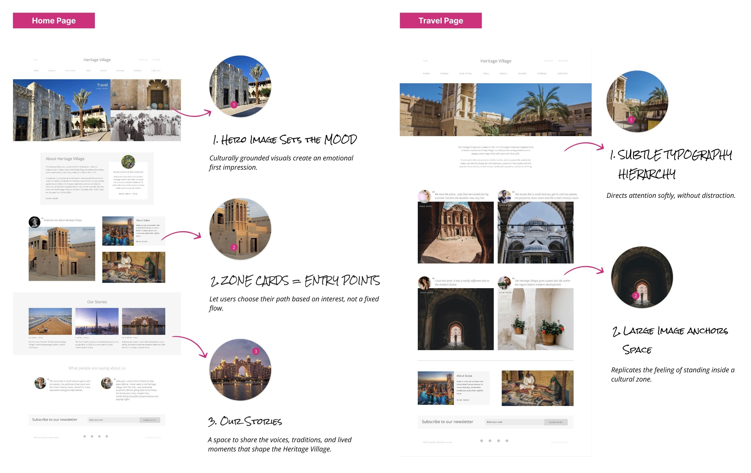
From research to rhythm. A digital space that feels like the real one.

High-fidelity screens combining cultural insight with calm design. Each page invites exploration through soft tones, intuitive structure, and immersive imagery, reflecting the quiet, open rhythm of the Heritage Village itself.

Sometimes the most powerful design, decision is to slow down.

Not every problem needs a faster flow or a cleaner component. Sometimes it needs patience. Observation. Respect for a culture that doesn't fit neatly into a wireframe.

I learned to work with ambiguity. To honor voices that weren't in any research brief. To translate something intangible, the feeling of a place, into something a screen could hold.

The quiet designs are often the hardest ones to make. They're also the ones that stay with you.

A place that hits differently in person. Online, it barely existed.

Dubai Heritage Village is one of those places that slows you down without you realising it. Open-air exhibits. Maritime history. Desert farming. Traditional crafts being practiced live.

Online? It barely existed.

No proper website, no structure, no story. Tourists couldn't figure out what it was or why they should care before showing up.

The brief was simple: fix that. The challenge was harder, design something that didn't just give directions and opening times, but something that actually felt like the place.

A UX case study where I tried to translate tradition into interface.

Spoiler: there was a lot of sand, and a lot of scrolling.

I didn't send out surveys. I didn't run usability tests. I watched.

Travel vlogs, visitor reviews, photo essays, cultural preservation documentation. I mapped the materials and rhythms of the village, rope, palm fronds, textiles, slow-moving crafts. I paid attention to emotional cues. How people talked about their visits. What stuck. What made them smile.

This was contextual inquiry and ethnographic research at its most digital. No interviews, but lots of careful listening.

→Explored travel vlogs, visitor reviews, and photo essays.

→Read up on Dubai's cultural preservation efforts.

→Mapped materials and rhythms across the village: rope, palm fronds, textiles, slow-moving crafts.

→Paid attention to emotional cues - what people remembered, what made them pause, what made them smile.

People didn't move through the Heritage Village like users clicking links on a website. They wandered, paused, revisited.

This concept is more than just a space. It's about reading behaviour.

After conducting contextual inquiry and analyzing vlogs, visitor reviews, and walkthrough footage, I began noticing patterns, not in what people said, but in what they did.

It became clear that I wasn't designing for a task-based interaction. I was designing for a spatial, emotional journey.

Exploration was non-linear
Users moved freely between spaces, often circling back rather than progressing step by step.
Emotional Engagement
Visitors were drawn to tactile experiences, rope, pottery, weaving, which slowed their pace.
Cultural Knowledge
Most users lacked historical context and needed visual storytelling to feel connected

From sticky notes to zones of experience.

Every wireframe started with one question: what if you could scroll through this site the way you'd walk through the village?

Low-fidelity first, intentionally rough, intentionally open. Testing ideas quickly before committing to any direction.

Bringing heritage to life through soft, grounded design choices.

The visual language was inspired by the textures, tones, and emotional quiet of the Dubai Heritage Village. Every decision, from color to typography, was made to reflect a sense of place that feels calm, grounded, and respectful of culture.

Nothing loud. Nothing that competed with the culture it was trying to represent.
From research to rhythm. A digital space that feels like the real one.

High-fidelity screens combining cultural insight with calm design. Each page invites exploration through soft tones, intuitive structure, and immersive imagery, reflecting the quiet, open rhythm of the Heritage Village itself.
Sometimes the most powerful design, decision is to slow down.

Not every problem needs a faster flow or a cleaner component. Sometimes it needs patience. Observation. Respect for a culture that doesn't fit neatly into a wireframe.

I learned to work with ambiguity. To honor voices that weren't in any research brief. To translate something intangible, the feeling of a place, into something a screen could hold.

The quiet designs are often the hardest ones to make. They're also the ones that stay with you.

Create a free website with Framer, the website builder loved by startups, designers and agencies.